Outbound connection requests
Starts at
Connection requests sent
Denominator
Everything divides by requests sent
The only funnel you fully control the top of, and the only one with a hard ceiling on volume.
Every guide draws one funnel. There are three, they use different denominators, and blending them is exactly why the published conversion rates you have been benchmarking against disagree with each other.
Short answer
1,000 connection requests produce roughly 285 accepted and 30 replies using published rates. Below that point no vendor publishes anything, so the meeting count depends on assumptions you should replace with your own numbers.
These are three different machines. When a guide averages them into one diagram, every rate in it describes a campaign nobody actually ran.
Starts at
Connection requests sent
Denominator
Everything divides by requests sent
The only funnel you fully control the top of, and the only one with a hard ceiling on volume.
Starts at
Post impressions
Denominator
Everything divides by impressions
Slower to start and impossible to forecast, but the replies arrive warm and cost nothing per unit.
Starts at
Ad impressions
Denominator
Everything divides by impressions, then by form opens
Predictable volume, prefilled forms, and the lowest intent per lead of the three.
Drawn exactly to scale, because the collapse is the whole story and most funnel diagrams hide it by making every stage the same size.
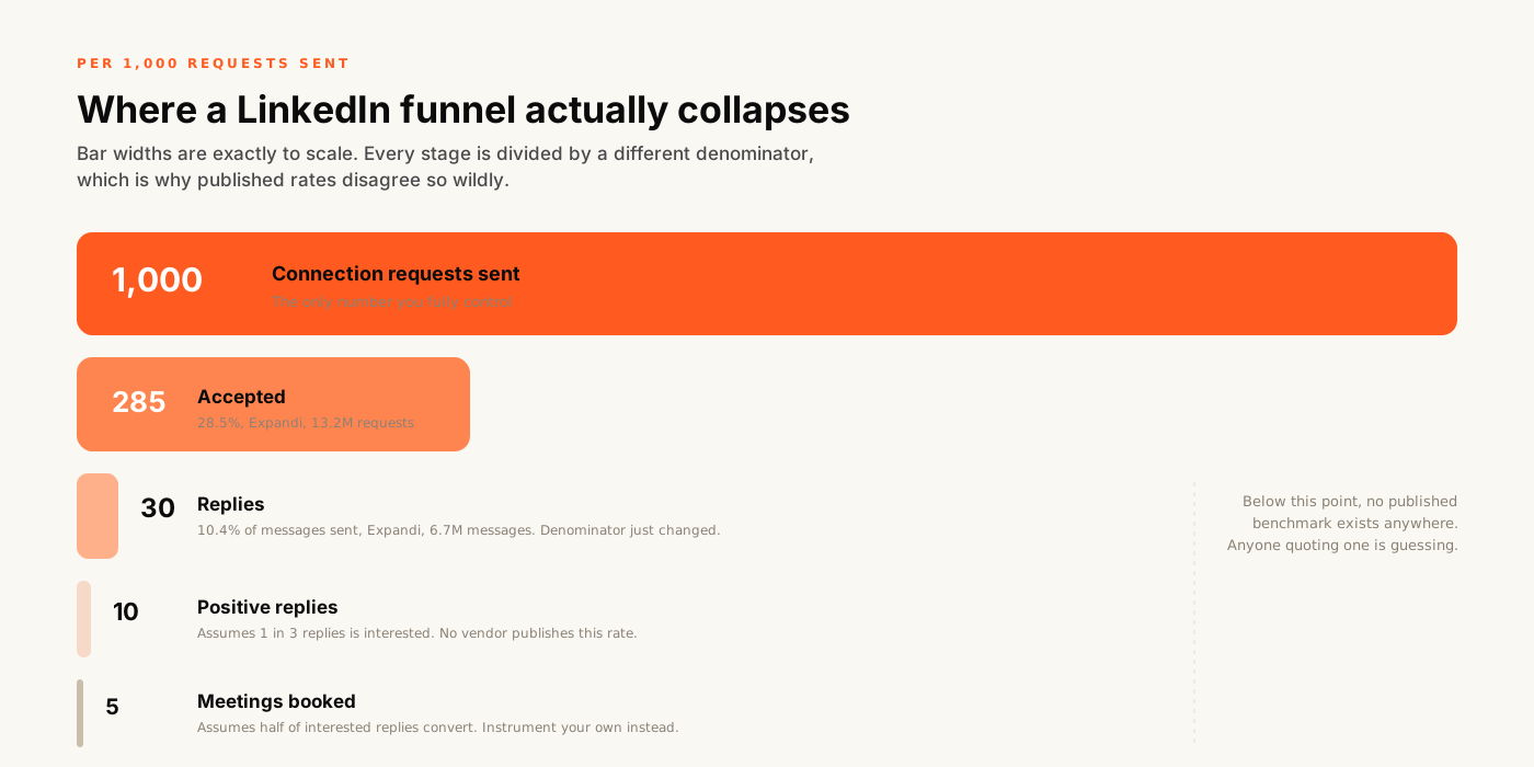
Note where the sourced data stops. The top two conversions come from datasets of millions of requests. The bottom two come from assumptions, and we have labelled them as such because every other page on this topic presents the same guesses as benchmarks.
| Stage | Published rate | Source, sample and denominator |
|---|---|---|
| Requests sent | Your input | Capped by LinkedIn activity limits, not by budget |
| Accepted | 28.5% | Expandi, 13,218,869 requests, May 2025 to Apr 2026 |
| Accepted (second reading) | 26% | Belkins, 2025 dataset |
| Replied | 10.4% | Expandi, 6,730,447 messages. Note: divided by messages sent, not by accepted |
| Replied (second reading) | 7.2% | Belkins, 15.1M contacts, replies divided by messages sent |
| Positive reply | Not published | No vendor publishes a positive-reply rate. Anyone quoting one is estimating |
| Meeting booked | Not published | No vendor publishes a reply-to-meeting rate either. Instrument your own |
Figures checked August 2026. The two greyed rows are not omissions. No vendor publishes those rates, and we would rather leave a gap than fill it with a number we invented. More on how these datasets relate in our stack breakdown.
Run the arithmetic backwards. If 1,000 requests produce around five meetings, then ten meetings a month needs roughly two thousand requests a month from a single profile.
LinkedIn does not publish numeric limits and we will not pretend to know them, but activity rate is policed and aggressive sending is what gets accounts restricted. In practice one profile cannot sustain that volume safely. Scaling means more sending accounts, or better conversion below the acceptance stage. It does not mean turning the dial up.
This is why the honest answer to “can we double the meetings” is usually about targeting rather than volume. We cover what is safe to automate and what is not on our LinkedIn automation page.
Campaigns rarely fail everywhere at once. They fail at one stage, and the stage tells you the fix.
You are in the wrong audience, not using the wrong words. Acceptance ranges 17.5% to 40.1% by industry, while the sender's seniority moves it about 3 points.
The first message is pitching. Acceptance says your targeting is fine, so the problem sits entirely in what you sent afterwards.
Usually speed. Interested replies cool within hours, and most teams have nobody whose actual job is answering them the same day.
Qualification happened too late or not at all. A meeting booked from a polite reply is not a meeting with a buyer.
You exhausted the segment. A tightly defined list is a finite resource, and the fix is a new segment rather than more volume into the old one.
The full six-stage picture, and how we run it as a service, is on the LinkedIn lead generation page. What you would pay for it is on the B2B lead generation cost breakdown, and what you are buying from a provider is set out on the LinkedIn outreach agency page.
Two stages of this funnel are routinely reported without their denominator. For which metric to ask for at which stage, see prospecting vs lead generation, and for what happens to a lead after the reply, see MQL vs SQL and the handoff that breaks.
It is the sequence from a defined audience through to a booked meeting, but there are actually three of them and they are not interchangeable. The outbound funnel starts with connection requests sent. The inbound content funnel starts with post impressions. The paid funnel starts with ad impressions and Lead Gen Form opens. Each divides its conversion rates by a different denominator, which is the main reason published LinkedIn benchmarks disagree so violently with each other.
A free audit of your funnel stage by stage, using your numbers rather than published averages. You keep the analysis either way.
Thirty minutes. You will leave knowing which stage is actually costing you meetings.